
Recently, our team was tasked with building a mobile app display that would show a grid with both horizontal and vertical scrolling along with varying cell sizes. The view would also require both a horizontal and vertical static header, similar to what users are used to seeing with spreadsheets and tables.
After some initial research and the advice of some colleagues, we decided to use the UICollectionView provided in iOS using the Swift development language. The example below shows our final product built using a custom implementation of the UICollectionViewLayout. Some extra features incorporated into the design included having cells that always stop decelerating at a predetermined interval (30 minutes) and continuous scrolling up to the maximum amount of available guide data
Challenges of Implementing UICollectionViewFlowLayout
According to the Apple documentation, “a collection view is a way to present an ordered set of data items using a flexible and changeable layout.” This sounds fantastic! Upon further research, you will quickly learn that only one layout is predefined, that is the UICollectionViewFlowLayout. The Flow layout utilizes a line-wrapping style where items are placed one after the other until they reach the end of the figurative line, defined by the context size, and then wrap to the next line.
This is where many people end up on StackOverflow. Even though our requirements don’t mention anything about line-wrapping items, couldn’t we just make the context size big enough to hold an entire section?
Yes, absolutely! Except for the fine print: Our design required the collection to be scrolled both horizontally and vertically. This is not an option using the UICollectionViewFlowLayout. The design also called for two more tricky traits:
Dynamically sized cells where each cell could have a different size from the previous and next cell in the collection.
Floating headers to visually define rows and headers.
The devil is always in the details.
For the sake of completeness, I’ve included some visual examples of the line-wrapping functionality provided by UICollectionViewFlowLayout. Both the horizontal and vertical options are displayed below along with descriptions.
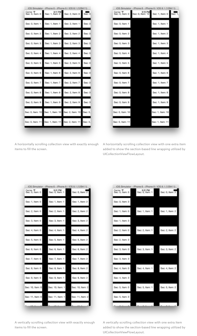
Now what? We can’t use UICollectionViewFlowLayout if we want multidirectional scrolling and items to continue past the edge of the screen, but there is another option. Creating custom layouts by subclassing UICollectionViewLayout.
By subclassing UICollectionViewLayout, we will take full control of the construction of the collection. This opens up the collection to horizontal and vertical scrolling and anything in between. To complete our custom design we will break the process into three tasks, building a custom layout, implementing sticky headers along both the x- and y-axis, and allowing independent cells to have unique size constraints. The layout will function by mapping the items into a pixel-based grid. This will be the key to our varying size blocks and floating headers.
Let’s get started. We’ll walk through the entire process below with examples based in iOS 8 and Swift, using Apple’s documentation for creating custom collection view layouts.
Step 1: Building a Custom Layout
First, we will want to set up a basic iOS project with a standard UICollectionView to use as a starting point. To save time, we have provided a simple starter project available on GitHub. However, if you are the DIY type, step-by-step instructions (complete with pretty pictures) have also been provided in the readme file of the GitHub project under the “Starting From Scratch” section.
After you download or create the starter project, you should be able to run the application on an iOS simulator and see an empty black screen resembling your empty collection view. Now we will want to hook that up to a beautiful collection. Let’s get started.
Filling The Collection View
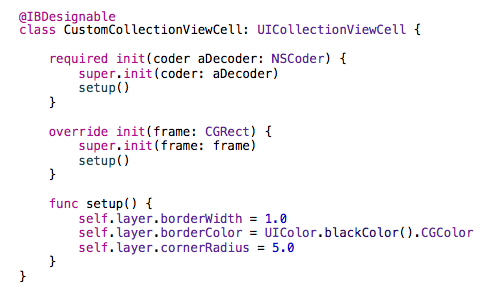
For the purpose of this blog post, we will use a simple cell with a label designating the section and item number. Start by adding another new Cocoa Touch class to your project. Subclass UICollectionViewCell and name it CustomCollectionViewCell. We will use this file for managing outlet connections and providing some design flair providing visual feedback on cell sizes. Once you’ve created the file, add an @IBDesignable annotation above the class definition and enter the following init and setup functions into the class. These functions will provide a small black border around the cell. The @IBDesignable annotation will inform Interface Builder that you would like these design cues to be represented in the storyboard.
Now that we’ve created our basic classes, we’ll need to wire them up in the storyboard. Open up the storyboard and select the Collection View Cell. In the Utilities Panel, switch to the Identity Inspector. In the Class dropdown menu, select our freshly implemented CustomCollectionViewCell. Now jump over to the Attributes Inspector and set the reuseIdentifier to customCell. This will allow our collection to reuse cells as they roll off screen instead of initializing a new cell for every object. Next, move over to the Size Inspector. Here you will want to define the width and height of the cell to 100 and 30, respectively. These values are only used to assist in storyboard development. In order to set the actual size of the cells, we will want to select the Collection View and change the cell size in the Size Inspector to 100×30 as well.
At this point, we have officially wired up the new UICollectionViewCell to the UICollectionView, however, it is still lacking a valid data source. Without a valid data source, the collection will never be populated by cells. You can verify this by running the project on the simulator and noting that no visual victories are displayed.
Next, you’ll need to implement the data source. Add a new Cocoa Touch Class to your project. Make this class a subclass of UICollectionViewController and name it CustomCollectionViewController. This class will act as both the data source and delegate since UICollectionViewController conforms to both of our desired protocols: UICollectionViewDataSource and UICollectionViewDelegate. The data source will act as a vendor providing views and information, while the delegate handles managing selections and performing actions within the collection. For our purposes, we will be dealing mainly with the data source.
Once you have created the CustomCollectionViewController.swift file, you will need to match up the reuseIdentifier with the one we defined earlier in the storyboard. At the top of the file, change the reuseIdentifier to customCell. In order to see our Collection View in action, we’ll start off small. Change the return values in both numberOfSectionsInCollectionView and collectionView:numberOfItemsInSection to 10. This tells the iOS to expect 10 sections with 10 cells each. You’ll also want to make two changes in the collectionView:cellForItemAtIndexPath function. First, change the cast for the variable cell from UICollectionViewCell to CustomCollectionViewCell; this is the cell we defined earlier. Second, add the following code to set the label in the cell to identify the index path: cell.label.text = “Sec \(indexPath.section)/Item \(indexPath.item)”.
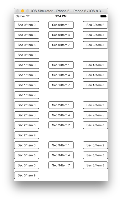
At this point, you should be able to run the project and see your cells magically appear within the view. The cells will only scroll one direction, but we’ll fix that soon enough. Here’s a screenshot of the application running up to this point on the iPhone 6 simulator. If you would like to check your progress, you can do so by looking at the sample code hosted on GitHub.
Building a Layout
Now that you have a basic working UICollectionView, you’ll want to jump into the world of custom layouts. Custom layouts are very powerful in iOS. Custom layouts can be used to design views to hold almost any form of dynamic data. In this blog post, we’re going to focus mainly on building a grid-like layout with different size cells and sticky headers along the horizontal and vertical axis.
To get started, add a new Cocoa Touch Class file. Name the file CustomCollectionViewLayout and have it subclass UICollectionViewLayout. The job of this class will be to provide the collection view with information on cells, supplementary views, and decoration views. The layout will not actually create any front-end views, but instead provides the collection view with all the required information to display the necessary data to the user as they move around within the view. UICollectionViewLayout is an abstract class and requires us to implement the following methods:
collectionViewContentSize
layoutAttributesForElementsInRect:
layoutAttributesForItemAtIndexPath:
shouldInvalidateLayoutForBoundsChange:
If your collection uses supplementary or decoration views, it would also require the use of layoutAttributesForSupplementaryViewOfKind:atIndexPath: and layoutAttributesForDecorationViewOfKind:atIndexPath:. This blog post won’t utilize either of these methods, but will require the use of prepareLayout, which will run before the collection view attempts to present any content. This allows us to perform any calculations we feel are necessary ahead of time.
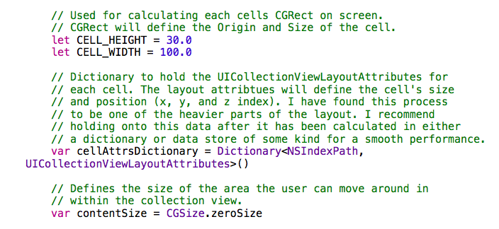
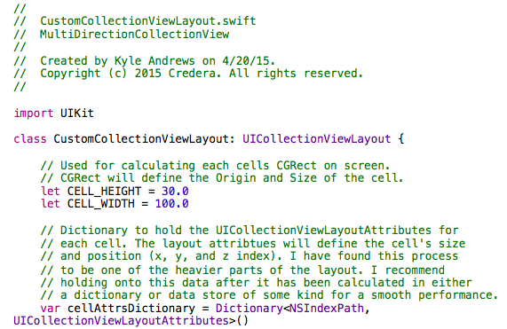
First, start off by defining some class variables for our layout. Add the following variables just after the class declaration in your new file. The comments will explain each variable’s role in the layout.
After adding the variables above, define the collectionViewContentSize method and have it simply return self.contentSize. We will update this variable as necessary in prepareLayout. Using this variable, we can refrain from performing the calculations in more than one place.
Now let’s work on the prepareLayout method. This method will be performing most of the heavy lifting for our layout and will hold most of our code. PrepareLayout will cycle through our data source calculating each cell’s position within the collection and compiling attribute objects that will provide this data to the collection view.
Add the prepareLayout() method just below your collectionViewContentSize() method. We want to accomplish two things each time this method is run:
Generate UICollectionViewAttributeLayouts with each cell’s position and size.
Calculate the correct contentSize for our collection view.
To generate each cell’s attributes, write a pair of nested for loops to cycle through every item in your data source. For each item, run the following code to generate the attributes and store them in your local dictionary cache.
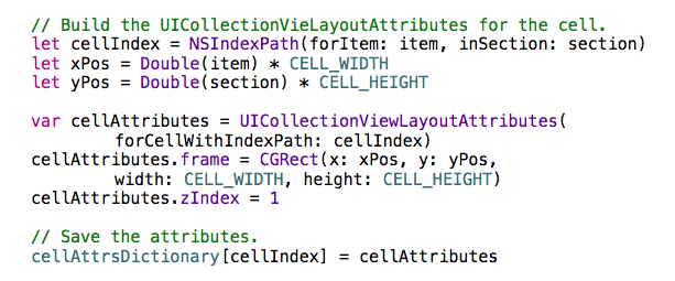
Code for the complete class will be at the end of the section to double-check your work.
After the two loops above, but still inside the prepareLayout method, add a snippet of code to update contentSize variable using the CELL_WIDTH and CELL_HEIGHT variables and numbers from your data source.
At this point, your layout is compiling all the required attributes for the cells in your data source and updating the content size. Since your layout attributes are readily available via the dictionary variable, the layoutAttributesForElementAtIndexPath code should be fairly straightforward. Add the layoutAttributesForElementAtIndexPath and use the indexPath variable to retrieve the attributes from the dictionary and return them to the collection view.
Now the collection view has determined its size, prepared its data, and even gained access to its layout attributes. All that’s left is to tell the collection which cells should be displayed within the portion of context being shown to the user. Add the layoutAttributesForElementInRect method to your class. For this method, define a mutable array of UICollectionViewLayoutAttributes. Then cycle through every attribute in your dictionary and check if it intersects the current content. If it does, add it to the array. After checking all elements, return the array. The code to check if a cell intersects with the current context is as follows:
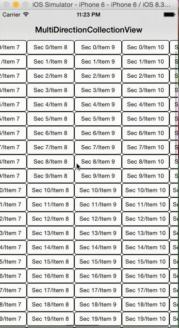
At this point, you should be able to run the project and see your collection displayed in the form of a grid. The collection should also allow for scrolling in all directions; however, the amount of data provided doesn’t seem to completely fill the vertical space of an iPhone. So let’s jump back over to CustomCollectionViewController.swift and increase the number of sections to 50 and the number of items in each section to 20. If your code is in order, you should be able to run the project and scroll both horizontally and vertically. Finally!
You probably noticed that we never actually implemented shouldInvalidateLayoutForBoundsChange. We will use this to add sticky headers, but for now our code is the same as the default implementation. Go ahead and add this method at the bottom of your layout class and compare your class with our completed code on GitHub to see how they measure up side by side.
A screenshot of the application at this point is shown to the right. Click the image to see the application in action on Imgur.
Completed CustomCollectionViewLayout.swift
Step 2: Adding Column and Row Headers
Wow, we’ve been at this for quite some time now. Don’t fear, we’ll be done soon. Let’s have a quick recap. At this point, you’ve built a simple collection view, populated it with data, and added a custom layout that allows for both horizontal and vertical scrolling. The only thing left to do is add some sticky headers along the edges.
The way we’ll accomplish this isn’t too complicated, however, care should be taken to ensure that the user is provided with a fast, efficient interface when working with large datasets. If the code for locking headers in place slows down the user, it will likely be in vain as users will be frustrated with the experience.
To get started, we need to revisit the shouldInvalidateLayoutForBoundsChange method. By changing the return statement of this method to true, we can force the collection view to call prepareLayout every time the bounds change. For obvious reasons, we need to make sure the prepareLayout method is very, very fast. Go ahead and change shouldInvalidateLayoutForBoundsChange to return true, then jump back up to prepareLayout.
If you recall, when we ran prepareLayout the first time, we cached all the data we needed into a dictionary within our class. There would be no need to run through that code every time the bounds changed, but we do need to update the position for all of our header cells with every bounds change. To accomplish our changes in an efficient manner, add a Boolean class variable called dataSourceDidUpdate and set it equal to true. We can use this variable to track data source changes. After we generate all of our required attributes, we can set the value to false and repurpose prepareLayout to manage header cell positions until the next time the data source updates the value to true.
At the beginning of your prepareLayout method, create an if statement that runs only when dataSourceDidUpdate is false. Inside this if block, you will need to perform the following actions:
Determine the current content offset.
Update the attributes for the top-right corner cell to have an origin lined up with the current content offset.
Cycle through the section and update the attributes for the first cell in each section to have an origin lined up with the x-axis content offset.
Cycle through every item in the first section and update the attributes for the cell to have an origin lined up with the y-axis of the content offset.
Take a swing at writing this code yourself. You should be able to utilize similar algorithms defined within the previous prepareLayout method to cycle through all of the cells. While cycling through the cells, determine whether or not the cell is a header cell and then update frame.origin element of the UICollectionViewLayoutAttributes object to move the cell into the correct position. Here is a snippet of code showing exactly how to change the origin for a cell’s attributes.

If you’ve updated the prepareLayout function correctly, you should be able to run the application to see the first row and first column “stick” to the sides as headers while scrolling throughout the view. When you’re ready, feel free to jump over to GitHub and compare your changes with our completed layout. You can also see our finished collection in action over at Imgur.
Step 3: Dynamic Cell Sizing
OK, so now you’ve built this completely custom, tricked-out collection view and it looks fantastic! But you still have one minor problem—it requires all of your cells to be the same size. Wouldn’t it be great if your cells could be all different sizes similar to a spreadsheet where cells can be merged or a TV guide where shows can have different lengths? Yes! So let’s tweak the layout one last time to see that in action.
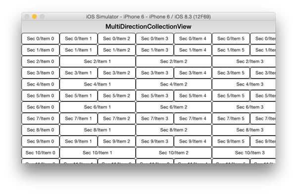
Since our layout is mapping out each cell onto a grid using pixel calculations, there is no reason we can’t change up the sizes of the cells. For a simple example, let’s make all even numbered sections have cells twice the length of odd numbered sections.
Open up the CustomCollectionViewLayout and jump straight into your prepareLayout method and find the section of code that creates the CGRect for the UICollectionViewLayoutAttributes.frame element. You’ll need to perform a few extra calculations to accomplish the desired look.
Change xPos from a constant to a variable and create another variable called calculatedCellWidth. Both variables should be of type Double.
Use an if/else statement to set the variable’s values. If the cell is on an even numbered section and is
not
a header cell, set the calculatedCellWidth equal to 2 * CELL_WIDTH and the xPos equal to item * calculatedCellWidth – CELL_WIDTH. This will account for the header cell being smaller. Otherwise, set the variables to the previous values.
Update the CGRect initialization method to use our newly calculated values.
The updated code should look something like the following:
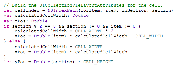
You should now be able to run the application and see cells of varying widths with your standard sticky headers still in place to guide the way.
Final Thoughts
For our specific set of goals and desired design, a custom collection view layout was the best solution. However, it is worth mentioning that in many cases UICollectionViewFlowLayout will provide a high quality collection-based layout with minimal development. The most common reason we see UICollectionViewLayout sub classed is to provide multidirectional scrolling. If your layout can conform to a line-breaking design where the data wraps at the end of screen, then UICollectionViewFlowLayout will provide you with a very good set of prebaked functionality.
Overall, UICollectionView is an incredibly powerful tool providing developers with an avenue for organizing and displaying large amounts of dynamic data. Some of the features of collection views not discussed in this blog include: section insets, item spacing, item sizing (flow layout), and supplementary views. While these items weren’t implemented in this scenario, we encourage you to explore the functionality available in UICollectionView. It might be the solution to your next big problem!
Have feedback or questions? Post a comment below, and be sure to visit us on LinkedIn and Twitter.
Contact Us
Ready to achieve your vision? We're here to help.
We'd love to start a conversation. Fill out the form and we'll connect you with the right person.
Searching for a new career?
View job openings