
Blog
Jul 15, 2021
Level up Your Azure DevOps Reporting Part 1: Creating Analytics Views in PowerBI


Azure DevOps (ADO) is a popular tool for centralizing code repositories, work item backlogs, and deployment pipelines for software development projects. If you regularly work with ADO, much of your work is likely through Azure Boards where work items are created, assigned, updated, organized into sprints, and marked complete. Whether you’re a team manager or an individual contributor, you may find it valuable to track open issues, measure progress toward releases, or evaluate team productivity through Azure Boards to keep your projects on track.
While ADO provides some in-house widgets and queries to summarize your boards, they do not have the versatility, granularity, or scalability needed to accomplish these goals. One method of unlocking effective data modeling and specialized visualizations is importing work item data into Power BI to get the most out of your sprints. In a recent project with an oil-and-gas software developer, Credera enabled the client to track progress towards each new release across teams and projects using this Power BI connection.
There are two methods to query your DevOps data and build Power BI reports: creating analytics views and writing OData queries. In this post, we'll take a look at creating analytics views to get your reporting running in a matter of minutes.
In this introduction, I'll be using the Tailwind Traders demo project. Follow along in a current DevOps project or by creating your own demo project.
What Are Analytics Views?
Analytics views are a preview feature of Azure Boards that are designed to quickly connect work item data to Power BI for visualization. Each row of data produced by an analytics view corresponds to a snapshot of one work item.
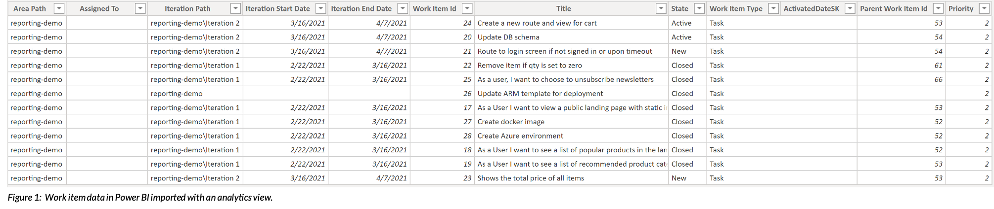

When creating or editing an analytics view in ADO, you set simple filters, select the desired attributes of each work item, and specify the date window. The default date window is set to the current date and results in a current snapshot of each item. The date window can also be expanded to include snapshots taken on previous dates and can be used to track trends over time.
Let's get started.
Creating Your First View
In order to get started with analytics views, you must enable the associated ADO feature. If you are working from an older project, you may need to review some additional permissions as well.
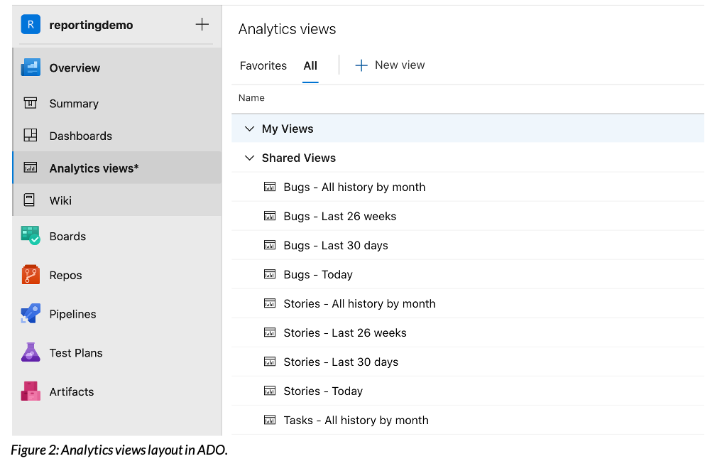
Once the feature is enabled, navigate to the "Analytics Views" tab in the "Overview" section on the left pane. This is the home for analytics views. While there are some pre-made views at our disposal, creating our own selections allows us to customize exactly which data points are included in the view.
First, we will make a view to create a task summary. Because work item data is organized in a hierarchy, we're only going to look at the "task" level for this report. You can create this analytics view with the Tailwind Traders data or your own. After clicking on "New View," the following instructions will help you navigate through each section of parameters to configure to build the view.
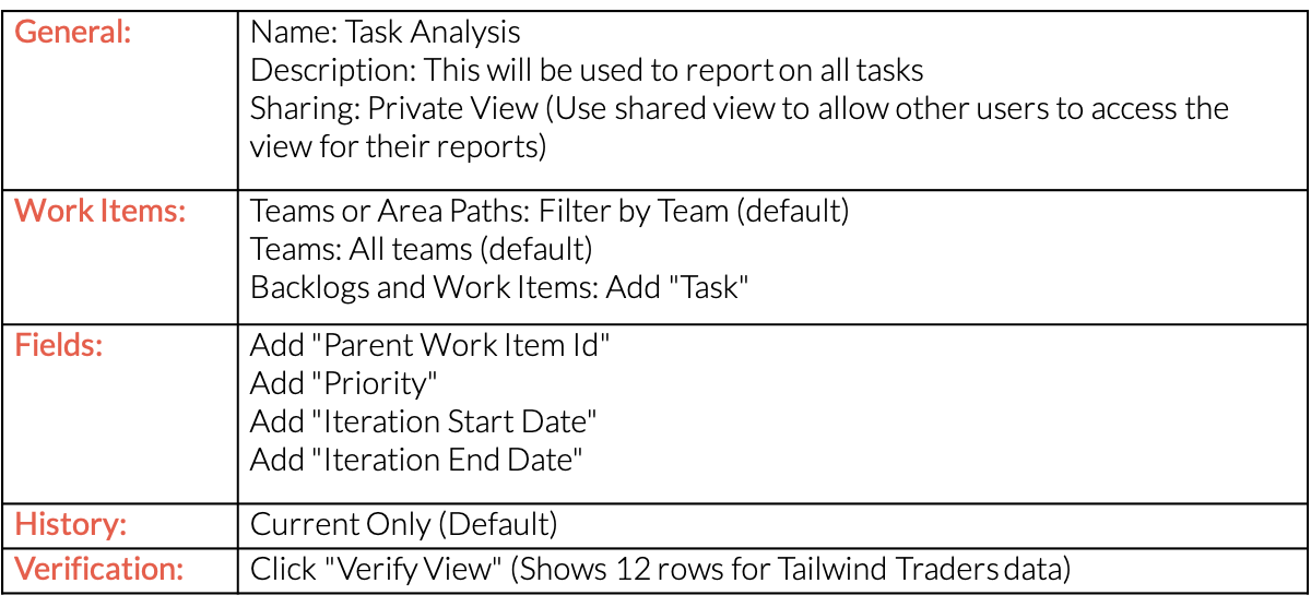
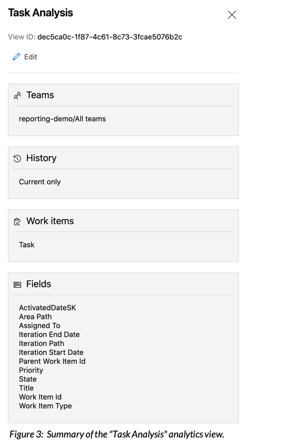
This analytics view collects data on all "Task" work items along with all the information needed to build the summary. After creating your view, click on the view name to show a summary of the selected parameters, as seen here.
Building a Report With Power BI Desktop
Now that we've built an analytics view, let's start building a report in Power BI Desktop. If you don't have it installed, you can download it for free and open it to create a new report.
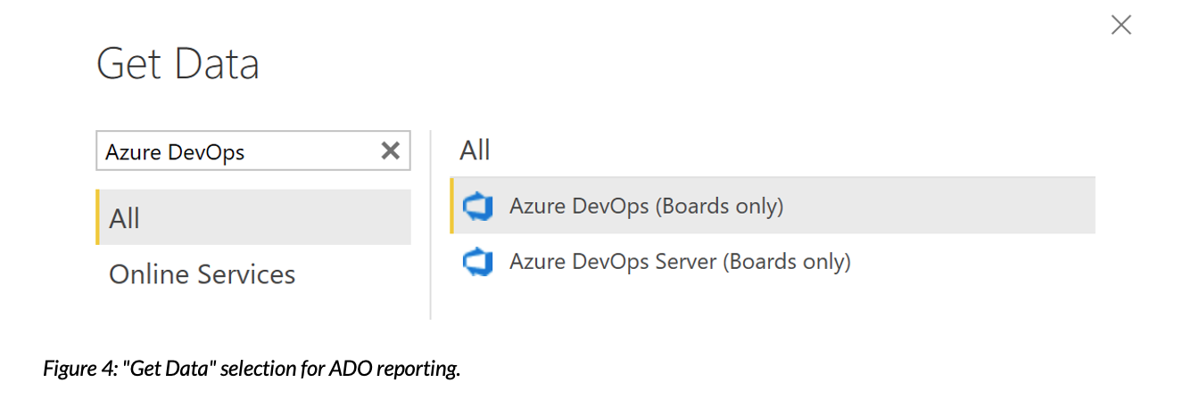
After clicking on "Get Data," use search to find the option "Azure DevOps (Boards Only)." Now simply enter your organization name and project name and sign in under "Organizational Account" with your ADO login information.
Select the analytics view we just created, "Task Analysis," and load the data. No transformation is necessary for this example, although Power BI provides many tools to customize the data to your specific needs. Some examples of these are covered in Microsoft's documentation if you would like to read more on this topic.
Now that the data is loaded into Power BI, we can create visualizations from the data. For this example, we will create a task summary to be used in our weekly sprint update meeting. The below visual illustrates the final product we are working toward.
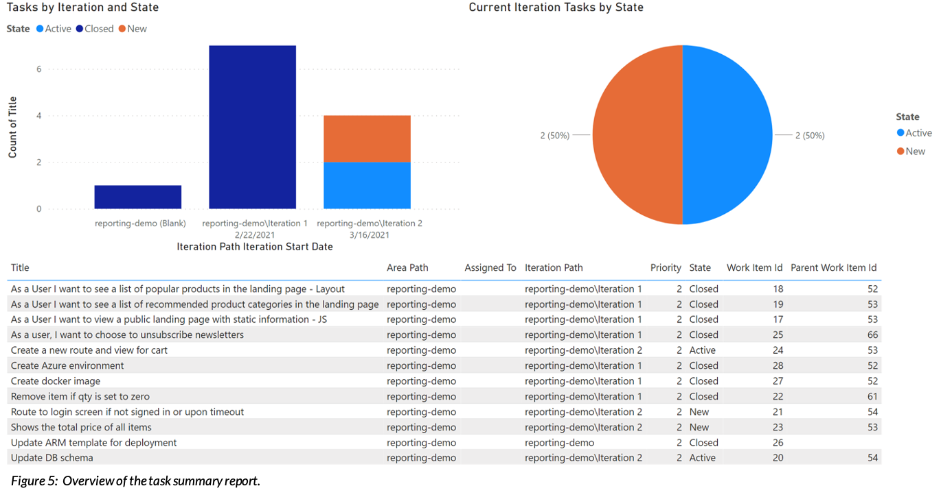
The top-left visual enables you to compare how the task count has changed over the past few sprints and calls attention to any tasks assigned to previous sprints that aren't complete by categorizing them as "New" or "Active" depending on whether the task has been started or not.
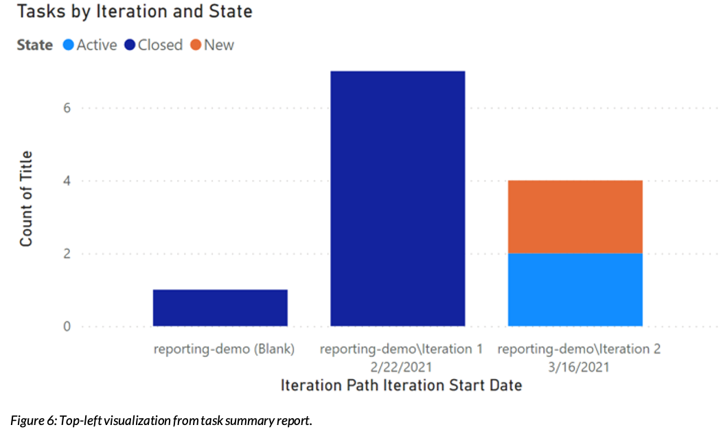
To build it, create a stacked column chart with "Iteration Path" and "Iteration Start Date" on the axis field, "State" in the legend field, and "Title" in the values field (aggregated by count). For this visualization, we also removed the default date hierarchy from the field "Iteration Start Date" to provide the actual date. To do this, simply right-click on the field and click on "Iteration Start Date."
On the top right, we have a pie chart with the states of current sprint tasks. This provides a high-level view of task completion progress that automatically updates to reflect the current sprint.
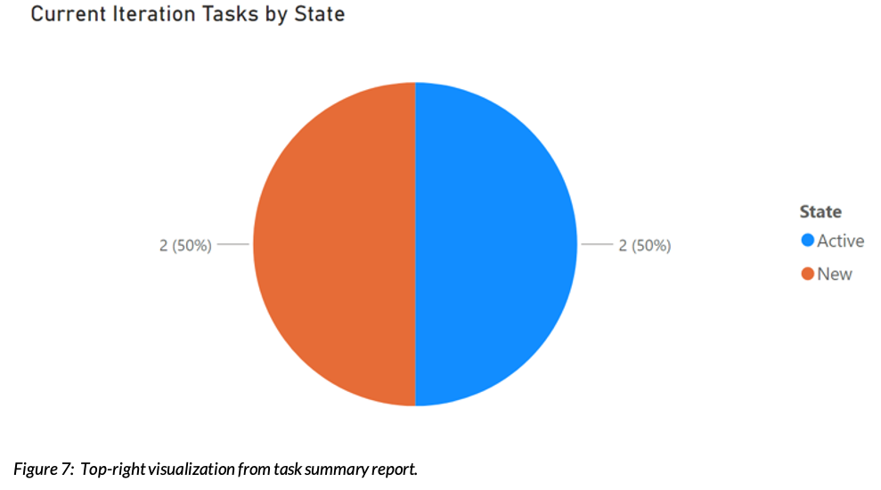
To create this, we need to create a custom measure. This measure will only count the tasks in the current sprint, filtering out any tasks where the assigned sprint has already ended or hasn't begun.
After clicking on "New Measure" in the "Modeling" tab, copy this formula into the expression editor:
Current Tasks = CALCULATE(COUNT('Task Analysis'[Title]),
FILTER('Task Analysis',
'Task Analysis'[Iteration Start Date] <= TODAY() &&
'Task Analysis'[Iteration End Date] > TODAY()
)
)
Use this measure, "Current Tasks," in the values field and "State" in the legend field to construct the pie chart.
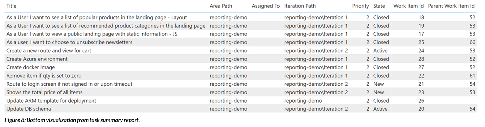
On the bottom, we have a table with a selection of the work item attributes, "Title," "Area Path," "Assigned To," "Iteration Path," "Priority," "Work Item Id," and "Parent Work Item Id." This visual helps you keep up with outstanding tasks. It delineates task titles by specific attributes, such as the sprint or team member it’s assigned to.
Compound Reporting
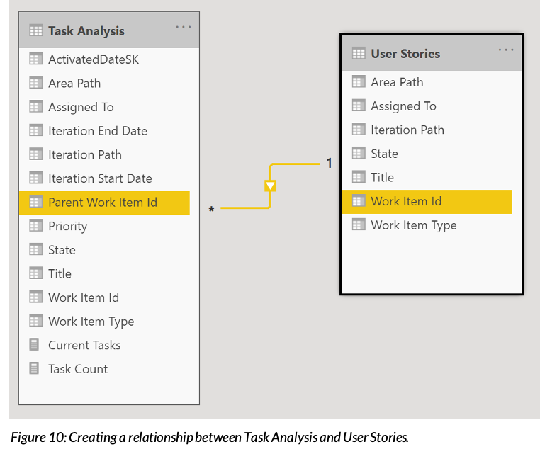
With our sample data, we've explored some different ways to report on tasks. One of the fields we included in our reporting table (the bottom visualization) is the "Parent Work Item Id." Most organizations organize work items hierarchically, and this field connects work items up the hierarchy. In the sample data, the level above task is "User Story," meaning many tasks may be under the same user story. While we currently only report on the ID of the parent work item, we can get even more detailed information by drilling down into each user story.
To group our tasks under user stories, we're going to need another view. Repeat the above steps on creating a new analytics view to create an analytics view called "User Stories." In the "Work Items" tab, add "User Stories" instead of "Tasks." You can then create the view with the default settings for each of the other steps.
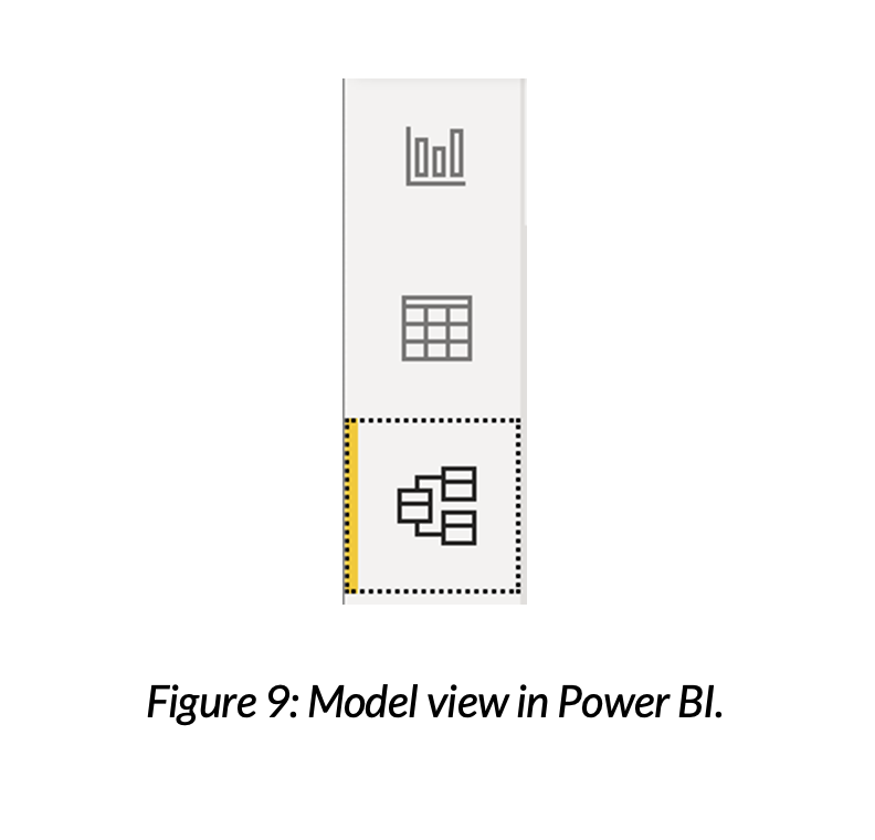
Now, the “User Stories” analytics view needs to be joined to our original view in Power BI. To do this, repeat the steps to build a Power BI report to add a new data source to your Power BI Desktop file, selecting the new analytics view table. Once this loads into the data model, navigate to the "Model View" using the tab on the far-left side of Power BI Desktop.
By clicking and dragging one field on top of the other, create a relationship between "Parent Work Id" of "Task Analysis" and "Work Item Id" of "User Stories."
With this expanded data model, we can now categorize tasks by their parent user story. Below is an example of a simple stacked column chart that displays the number of tasks by status for each user story.
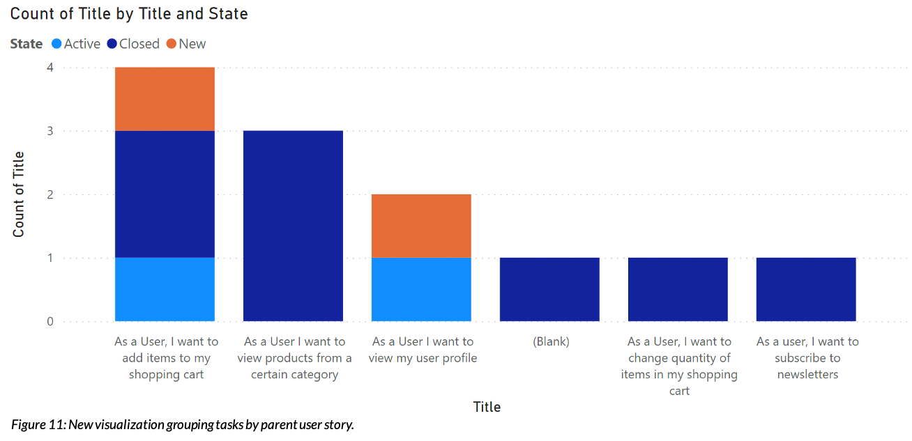
You can create a chart by placing "User Stories"[Title] under the axis field, "Task Analysis"[State] under the legend field, and "Task Analysis"[Title] under values (as a count).
Using Analytics Views to Enhance Your ADO Reporting
In this blog post, we explored how analytics views can expand the capabilities of ADO reporting in order to deepen your insights into your project progress. In the demo, we developed a task summary report and unlocked a new dimension, user stories, to meaningfully explore our data.
As you begin to experiment with more complex visualizations, such as rolling up data into multi-level categories, evaluating burndown across sprints, or grouping related work items, you may find the flatness of analytics views limiting. Using analytics view for complex reporting leads to complicated models, decreased performance, and sometimes hard limitations. In our next blog post, we’ll dive into upgrading your work item reporting with OData queries to solve these problems.
If you're interested in discussing your specific ADO reporting needs or want to learn more about how Credera can help transform your software development projects, reach out to us at marketing@credera.com.


Blog
Jul 8, 2021
5 Warning Signs Your DevSecOps Implementation Is Failing You
DevSecOps is a collection of disciplines that seeks to incorporate security as a first-class concept throughout the DevOps...


Blog
Apr 29, 2021
NoSQL vs. Relational Databases: When to Use NoSQL
Managed NoSQL databases have the power to free database administrators from various tasks like capacity planning and...

Blog
Feb 19, 2021
Realizing Value From Your Data Lake: Lessons Learned and Four Critical Mistakes to...
Data lakes are a great way to organize your company’s data, but a staggering number of data lakes fail to reach their true...


Contact Us
Let's talk!
We're ready to help turn your biggest challenges into your biggest advantages.
Searching for a new career?
View job openings